MARKET ANALYSIS
Relative strength in equities: where is capital shifting?

PART
Reading time: 6–8 minutes
America isn't losing its feathers — but capital is spreading its wings
Why this analysis is relevant now
Anyone following the stock markets over the past fifteen years could hardly ignore the dominance of the United States. US equities delivered superior returns, driven by scale, liquidity, and, above all, a small group of mega-caps. Think of companies that have grown so large that they can skew the performance of an entire index.
However, an analysis of relative performance That this story gains nuance. Not in the form of a sudden reversal, but through subtle shifts within and outside the US.
Such shifts are rarely spectacular on a daily basis, but on weekly charts they become surprisingly visible.
How do you read ratio charts between ETFs?
In a ratio chart, one ETF is divided by another. It sounds technical, but the interpretation is simple:
- Rising ratio → the Plate outperforms the denominator
- Declining ratio → the denominator is gaining ground
Important: This isn't about "is the market going up or down?", but about capital preference: where does the money flow to? Relative strength is a basic principle in technical analysis and can provide an early signal that investor preferences are shifting.
Below, we look at six ratios (weekly) that together tell a single story: America remains a heavyweight, but investors are becoming more selective and diversifying their attention.
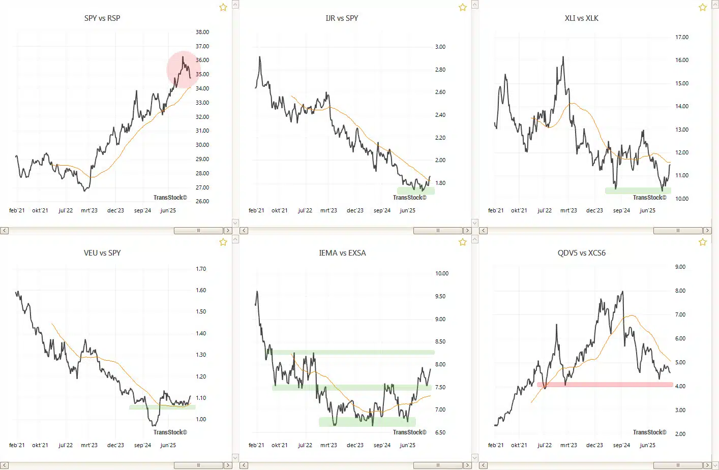
mega caps, small caps, sectors and regions.
Internal shifts within the US
1) SPY/RSP — megacap concentration under pressure
The ratio of the market-weighted S&P 500 (SPY) and the equal-weight variant (RSP) is an excellent indicator of concentration. When SPY outperforms RSP, it typically indicates dominance of the largest companies.
In the long run the trend was upward, which perfectly fit the “megacap era”. Since November 2025 However, you see a clear weakening. The ratio is approaching the rising moving average, which suggests that the dominance of the very largest is diminishing. This is not a detail: a declining concentration often means that returns wider becomes distributed over more shares.
2) IJR/SPY — Small caps show cautious recovery
After the pronounced rally since 2021, US small caps have lagged large caps for years. Since April 2025 gently changes that image. The IJR/SPY-ratio makes a rounded bottom and trades above the moving average.
This points to renewed interest in small caps. It's another sign that investors are looking beyond just scale and liquidity. In healthy market phases, we often see small caps and mid-caps gradually joining in.
3) XLI / XLK — Industry vs. Technology (Sector Rotation)
The ratio of industrial stocks (XLI) and technology (XLK) provides insight into sector rotation. Technology dominated the past decade, but the XLI/XLK-ratio stabilizes and shows signs of soil formation.
That's not an aversion to technology, but rather a normalization expectations. Investors appear less willing to pay extremely high valuations and are showing more interest in sectors with tangible cash flows and cyclical exposure. This pattern fits into the same broader trend: less "all-in-one-winners-basket."
4) SPY/VEU — S&P 500 vs. the World
Over the past fifteen years, the outperformance of US stocks compared to the rest of the world has been pronounced. Since March 2025 Does this ratio show signs of stabilization and soil formation? SPY/VEU is again trading above the moving average.
This doesn't mean the US is suddenly "weak." It does suggest that other markets are recovering, and that the exclusive "US-only" narrative is losing its appeal. This is relevant for portfolio management: if the world becomes relatively stronger, the likelihood that diversification will be rewarded again increases.
External shifts outside the US
5) IEMA / EXSA — emerging markets versus EuroStoxx 600
A look outside the US reminds us that emerging markets have been disappointing for a long time. Between 2009 and 2020, they largely moved sideways. From 2020 to early 2021, there was a strong period, after which things went downhill again—evident in a declining ratio.
Four years later you will notice on the graph that from average 2025 Emerging markets are once again outperforming the EuroStoxx 600. The moving average is tilted upward. And that's precisely what a ratio does: it shows that capital has to come from somewhere and is already flowing back into emerging markets.
Anyone who wants to follow this up can build a practical routine from it: review ratios quarterly, and only if there is continued improvement should consider giving EM a (limited) place in the core or satellite portfolio again.
6) QDV5 / XCS6 — India vs China
Even within the emerging markets themselves, attention is shifting. For years, Indian stocks were preferred, while China was systematically avoided. A declining QDV5/XCS6-ratio, however, indicates that China is regaining ground against India.
India remains a compelling growth story, but China's relative strength since late 2024 It's striking. This doesn't necessarily mean "China is now the new favorite," but it does mean it's a market that capital is once again taking seriously.
What can you do as an investor with these signals?
Ratio charts aren't crystal balls. But they do give structure to something that would otherwise remain vague: the direction of capitalYou don't need to predict perfectly; you just want to avoid getting stuck in an old regime for too long.
- Use ratios as early radar: Where is there consistently better performance?
- Work with simple trend filters: ratio above a moving average = “tailwind”.
- Enter with dosage: A reweighing does not have to be done all at once; building up can be done in stages.
- Keep diversifying: When the world recovers, diversification will become valuable again.
Anyone who applies this systematically will build up a discipline that takes little time, but helps you to move with changing market favorites.
Conclusion: no fall of America, but a broader flight
These six ratio charts show no break with American dominance. The United States remains attractive, driven by scale, liquidity, and innovation.
What does change is the direction of capital. Concentration in mega-caps is declining, small caps and industrials are gaining ground cautiously, and outside the US, both developed and emerging markets are gaining relative strength.
America is not losing its feathers.
But capital spreads its wings.
For investors, this means the classic "US-only" narrative is gaining nuance. By consulting ratio charts periodically—for example, quarterly—you align your portfolio not with statements or expectations, but with where capital is actually moving. And that's precisely what makes the difference in the long run.
Read further: Anyone looking for a practical framework to translate these kinds of signals into a robust portfolio structure will also find this on our website an in-depth guide which explains step by step how to work with core and satellite blocks.
relative strength stocks - Short FAQ
What exactly is “relative strength”?
Relative strength compares two markets, sectors, or ETFs. You don't see whether the market is rising or falling, but you do see which of the two is performing better and therefore attracts capital.
Why do ratio charts work so well with ETFs?
ETFs represent broad baskets. This allows you to filter out noise from individual stocks and focus on the "big moves" in preferences: regions, style factors, or sectors.
How often should I monitor ratios?
For most long-term investors, a quarterly rhythmWeekly charts rarely change trend within a few days.
Does this mean I should reduce the US?
Not necessarily. The signs point more to broadening: less concentration and more opportunities outside of the classic winners. Reweighting can be done gradually and based on your risk profile.
Aren't emerging markets "too risky"?
Emerging markets are more volatile and experience larger cycles. That's precisely why a trend or ratio filter is useful: it helps you avoid buying just because something "seems cheap."
Disclaimer: The information on this blog is for educational and informational purposes only. It does not constitute investment advice. Investing involves risks. Always do your own research before making any financial decisions.