Hollow Candle vs. Bar Chart: Clear AMD Reading with TransStock


AMD's recent performance through hollow candles
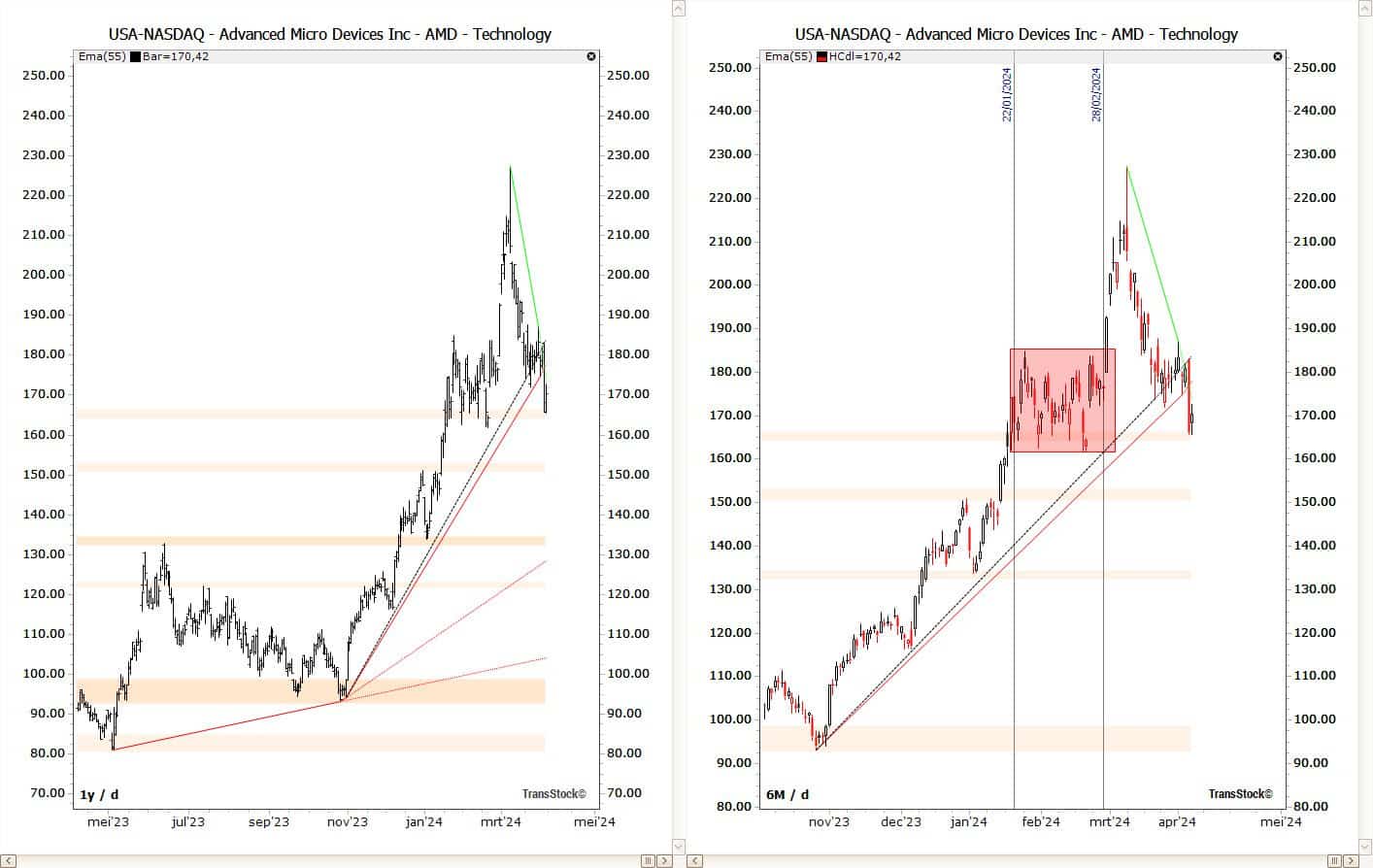
Less guesswork, more clarity. With the Hollow Candle Chart in TransStock read buying and selling pressure at a glance. Compared to the classic bar chart (bar chart) the hollow view shows market sentiment explicitly: hollow (white) candles for a higher close than open (buying pressure), filled for a lower close than open (selling pressure).
Educational; not investment advice.
Hollow Candle vs. Bar Chart: Which Is Faster to See?
- Sentiment – Hollow immediately shows whether buyers or sellers dominated the day; with bars, you have to determine the open/close yourself.
- Momentum – series of hollow candles in a rise or filled ones in a fall confirm the story.
- Turning point signals – switching from hollow → filled (or vice versa) around a pivot can be an early hint.
AMD Example: 1-Year Bar Chart vs. 6-Month Hollow Candlestick
On the left, you see AMD over one year as a bar chart; on the right, the last six months as a hollow candle. The hollow candlestick view makes periods of sustained selling pressure more visible, while the bar chart primarily shows the range without sentiment color.
How to enable Hollow Candle in TransStock
- Indicators Explorer → Price Plots → candlesticks → Hollow Candle check.
- Compare same tool: switch between bar chart and Hollow to combine context + sentiment.
- Combine with trend filters (e.g. Alligator) or MAs to confirm signals and reduce noise.
Reading tips
- Trend + sentiment: An uptrend with many hollow candles is stronger than one with mixed candles.
- Timeframes: check both day and week; consistent sentiment on both strengthens the story.
- Context: use pivot zones/support-resistance to frame reversals.
Want to discover sentiment faster?
Enable Hollow Candle in TransStock and combine reach, direction, and pressure into one clear image.
4,6 / 5